Visualize query dependencies in Power BI with Sankey diagram

Edit 7th August 2016: You’ll find an easier “OneInAll”-approach in the PowerBI forum here. Thanks to David Moss for reporting an issue with the solution below.

PBI-file with new query: NewAllInOneCode.zip ,

How to use:

Old post:

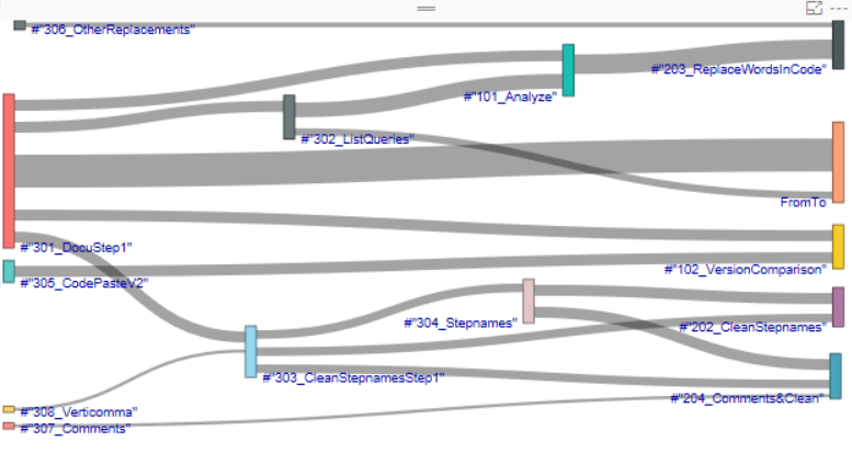
This week we got a new Sankey diagram. It has some advantages when visualizing dependencies between items/nodes, one being not to cut the labels. Time to share a tool that I use a lot when working with complex M-queries (in Power Query or Power BI). It shows how the queries are connected with each other:
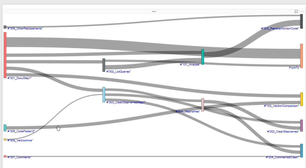
Image1
Sankey diagram default

Left stand the queries who fetch the source data, parameters and/or user defined filters, then you see how they get transformed until to the right you see the queries that deliver your end-results. Especially when working with codes that has been written by someone else I find it very useful to get a quick oversight of what’s happening – as an excellent complement to the documentations 🙂

You can also move the nodes around to improve readability:
Image2
Sankey diagram with adjusted nodes

Read more

Use R to export data from Power BI

Edit 03 Aug 2016: With the July 2016 release you can now run your R-scripts directly in the query-editor (so no row-limit any more!). No need to go via the visuals. But this will limit you to export datasets from the query-editor, so no DAX.

Edit 22 Jan 2016: Currently this method is limited to 150k rows! It will drop all others without warning!

Edit 25 Jan 2016: 150k rows is the limit on all R-scripts at the moment (link). A warning sign will be shown on the image. Will create a new blogpost if this changes – so stay tuned (by following this blog, Twitter or LinkedIn)

With the December release, Microsoft enabled Power BI’s content to be fetched from the R-feature. So instead of plotting this data to the screen, could we just export it to a file?

Yes we can:

write.table(trim(dataset), file=”your filepath & filename.txt”, sep = “\t”, row.names = FALSE);

write.table has a lot of options, which are explained here. I’ve only used a few here: Exactly defining the location where the output-file shall be stored (file=), setting tab as delimiter (sep=”\t”) and skipping row names, which would be an index in our example here.

In addition to that, I had to get rid of trailing whitespaces that somehow sneaked into the table (trim(dataset)). Therefore the gdata-package is needed. So the full R-code looks like this:

require(gdata)
write.table(trim(dataset), file=”your filepath & filename.txt”, sep = “\t”, row.names = FALSE)
plot(dataset);

Here you have to make sure to turn the slashes in the filepath: So if your path looks like this: C:\Users\Imke\Desktop\Rfile.txt you need to write it like this: C:/Users/Imke/Desktop/Rfile.txt

NEW: You find a function for this export here: https://github.com/ImkeF/M/blob/master/LibraryR/Table.ExportToCsv.pq , it swaps the slashed automatically.

Let’s take this as a start that will probably fulfill many users need to quickly export data from Power BI to simple text files. Further use cases I see are:

Read more

Visualize dependencies between your DAX measures: DAX-VizArt-Wizard

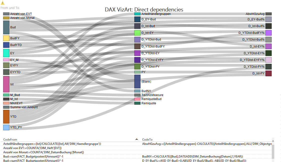
This DAX-VizArt-Wizard vizualizes dependencies between your DAX measures, shows the definition of all related measures and shows differences between the measures of 2 models/versions. This works for Power Pivot, Power BI and for Analysis Services Tabular (SSAS).

In the Power BI-Version you’ll see them in the Sankey-chart like this:

VizArt1

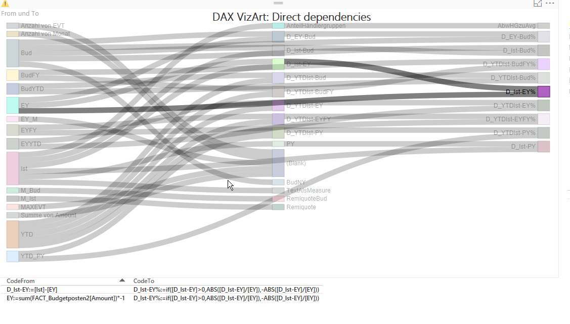
If select measures/nodes, all direct connections will be highlighted:

VizArt2Direct

In the second version, all indirect connections will be highlighted as well & the selected measure definitions will be shown.

Read more

Power Query & Power BI are ideal learning paths from Excel to R

Reading Jen Stirrup’s great article about the learning path for SQL Server 2016 and R I ended up learning my first R pieces from this wonderful post that she has referenced. There Tony Ojeda beautifully describes how basic Excel-concepts are translated into R.

Well – I cannot speak of so much personal experience here – but these R-codes came easy as nothing before to me. Apart from Tony’s first class didactics, could this be due to what I’ve learned in Power Query over the last year?

I’ve added the comparison of Excel and R by the M-code from Power Query – putting it in the middle:

RandPowerQueryV3

Do you find the similarities as striking as I do?

Read more

Tip for Parameter Tables in Power Query and Power BI

Parameter tables in Excel are normally set up like this: In order to retrieve the currency for example, you could write this: = Parameters[Value]{2} This returns the content of the “Value”-column of the query named “Parameter” that sits in the 3rd row (! Power Query starts to count at zero): EUR. Which is not bad, but also not … Read more

Happy Spreadsheet Day! (Or how to escape Excel-hell)

When reading horror-stories about Excel-hell describing how dangerous it is to use Excel in corporate environments, I cannot help but to think of this hilarious video describing the fatal consequences of acting without common sense: Just don’t do stupid things with it.

Although Excel comes nearly for free (in relation to what value it delivers) this doesn’t mean that you don’t need to invest in applying proper techniques (like in any other profession). There’s training and best practices for every different need.

But the best thing about Excel seems largely unknown still: Since the invention of Power Query it has never been easier to be save around Excel than before: A magic tool that can solve many of the problems that cause Excel hell: Repetitive tasks: The little adjustments and extensions that pile up when you use your workbook again and again and are often performed without realizing the (meanwhile complex) context of all the standard-Excel-elements involved: Power Query will prevent this mess. It will help you organize and automize your repetitive tasks in Excel.

Read more