
This DAX-VizArt-Wizard vizualizes dependencies between your DAX measures, shows the definition of all related measures and shows differences between the measures of 2 models/versions. This works for Power Pivot, Power BI and for Analysis Services Tabular (SSAS).
In the Power BI-Version you’ll see them in the Sankey-chart like this:

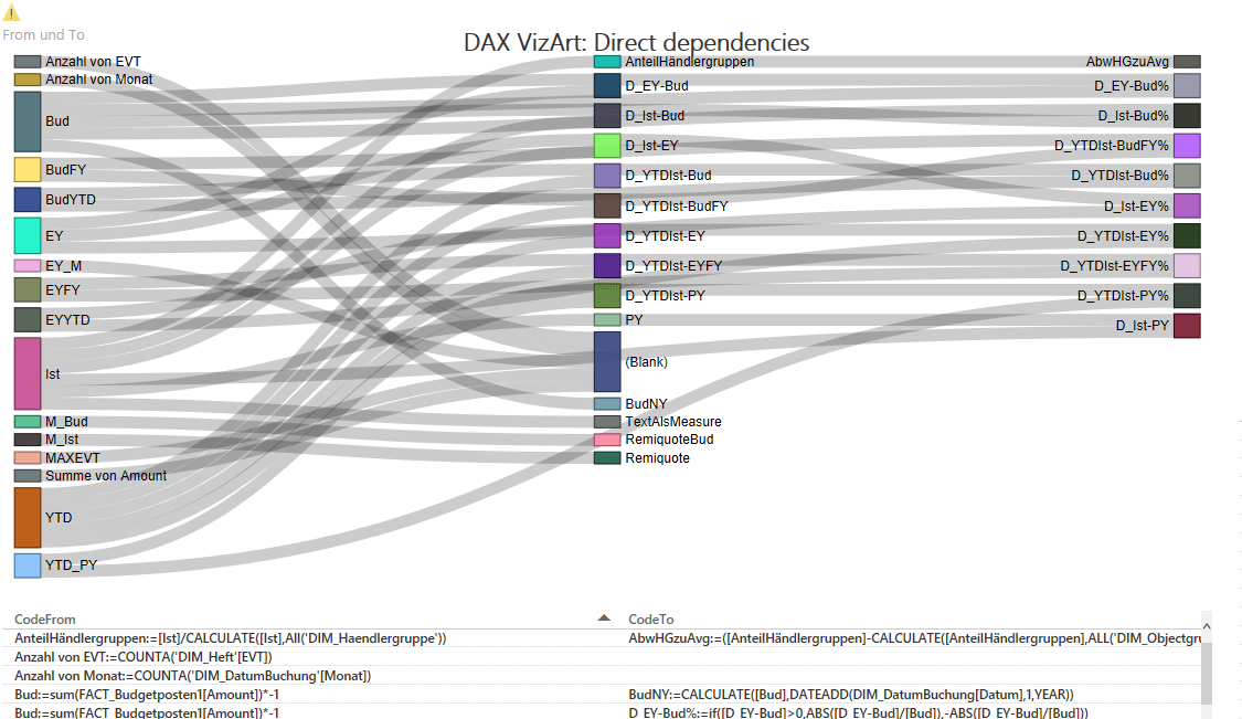
If select measures/nodes, all direct connections will be highlighted:

In the second version, all indirect connections will be highlighted as well & the selected measure definitions will be shown.

In the not-so-fancy Excel-Version you’ll see them in a table-Version, like some of you might know already from my Power Query Management Studio, where this code is mostly copied from:


You can also compare 2 versions of your model and show differences only:

So how to handle these tools?
- If you haven’t done already, download the sankey diagram from the Power BI Visuals Gallery.
- Extract your measures using DAX Studio like Matt Allington has posted here
- Reference this sheet from your file or copy the whole table into the Excel-sheet “DAX” (like I did in the example files).
- Refresh All
- Open the pbix in Power BI Desktop and check the reference to the xlsx-file – refresh as well
- Compare versions: In sheet “DAX_Version2” you can fill in the table from a previous version of your model and then sheet “VersionComparison” will give you all measures that have been changed, deleted or added (after the refresh).
- The blue “Analyse”-sheets give you some table outputs for analysing your measures with respect to their relations under each other if you don’t like the graphical form.
The M-code might not be ideal, as this is basically a variation of my Power Query Management Studio – expanded a bit to enable the Sankey-VizArt – so might contain some inefficiencies. So if you feel like cleaning up, adjusting or expanding – please run riot and share 🙂
There are 2 files, the pbix referencing the xlsx:
DAX_VizArt_Wizard.xlsxDAX_VizArtWizard-pbix.zip
Enjoy & stay queryious 🙂
Please tell me what you think of this DAX-VizArt-Wizard: Do you find this useful? Where would you use it for? Any ideas for improvement?
Edit 6th April 2016: Gerhard Brückl found a different way to accomplish the query for the chart here. Using DMV’s that also consider calculated columns!
I like the Excel style version, the visual one is a bit overwhelming
Thx for sharing
I have to agree with Andreas, I want to like the Sankey visual for the “coolness” factor, but I find the tables easier to use. That may change once I try it interactively.
Is there any option to allow the lines within the Sankey visual to be colored? I think that would greatly help avoid blending effect when looking at the overall picture (I would imagine it is cleaner when selecting sections in the visual itself).
No, not aware of coloring options. Some improvements coming in the new Sankey with labels (https://app.powerbi.com/visuals/show/Sankey1452239004508), as you can drag the items in order to improve readability. But the disadvantage there is that the “dragged layout” doesn’t stick.
Agree that Sankey is not ideal, but the only option (I’m aware of) providing directed connection graphic currently 🙁