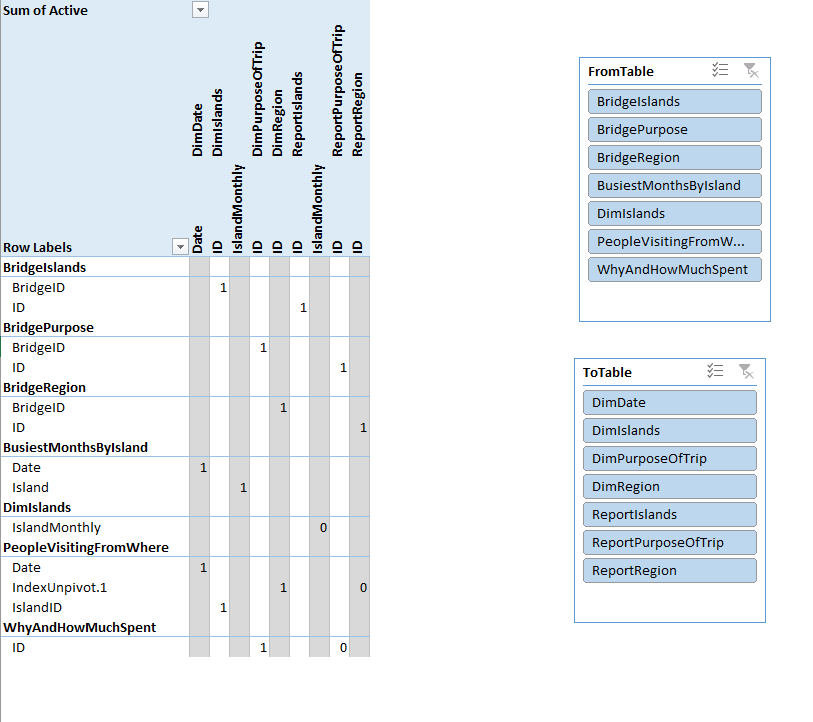
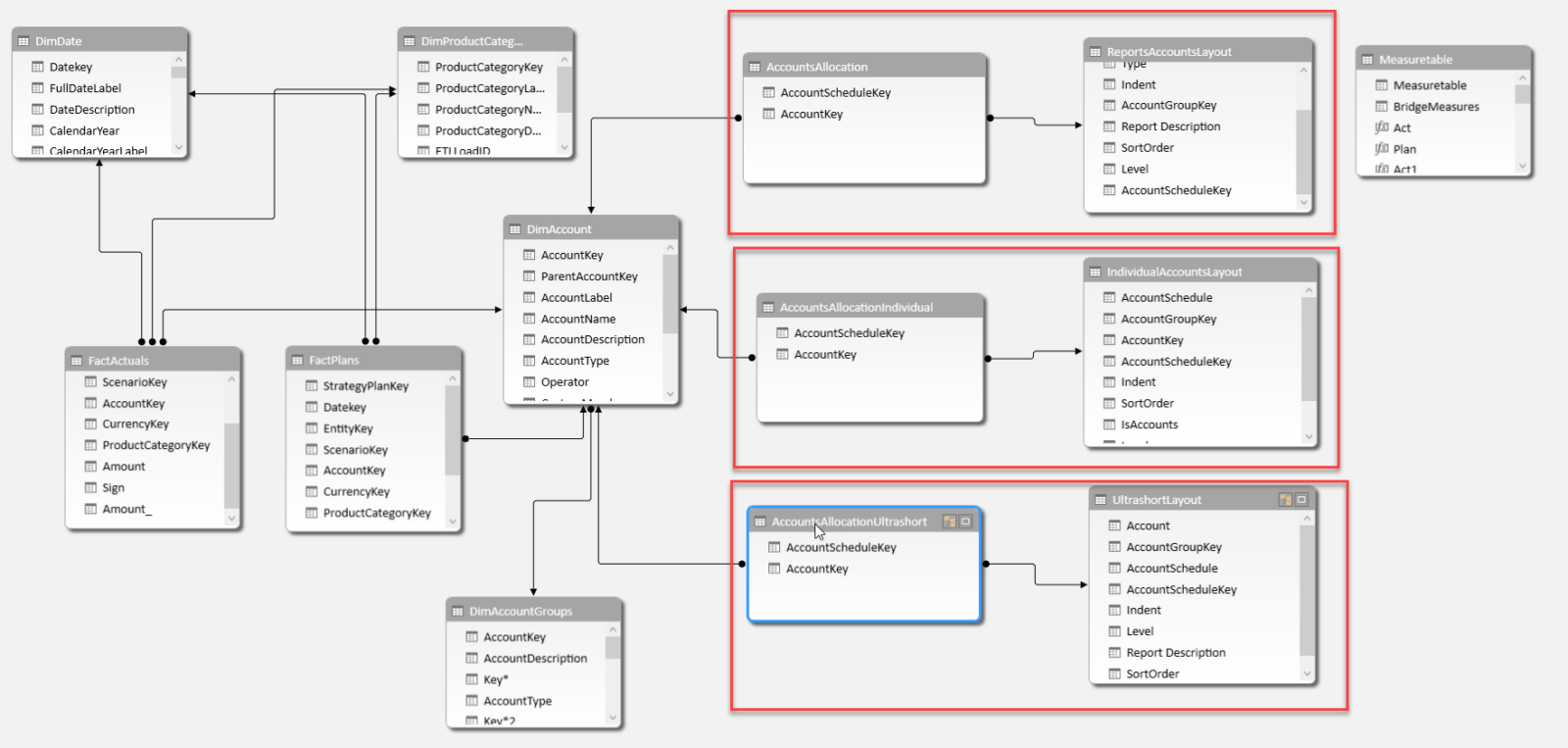
While the relationships view of the datamodel provides a very good overview which tables are connected to each other, one cannot see at a glance on which field they are connected to each other.
This is where a pivot table-view of the field-connections can be really helpful:
Pivot-table-view:
Table-Fields-Connections in Pivot-View
Here you see the tables on the many-side in the rows and in the columns are the tables on the one-side (of course you can change that). Add some slicers if your model is very large.
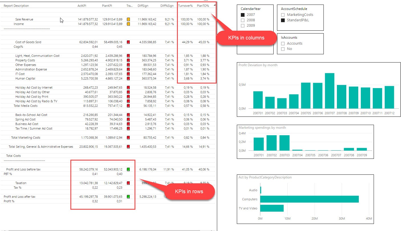
In finance & accounting, you very rarely report the figures with the signs of their source systems, but switch (certain) signs according to different needs. Instead of using unary operators for it, I’ll present an easy and dynamic way for it in Power BI and Power Pivot using DAX. It will cover the following 3 main scenarios:
1_SwitchAll: All signs are switched (red)
2_SwitchExpLiab: Expenses and liabilities are switched back to their original values (green)
3_BWT_Indiv: Only the main figure for expenses (or liabilities) carries a minus, all following positions specifying the expenses are (principally) reported as positives (blue)
Switching signs in Power BI and Power Pivot without unary operators
I’m using the sample data from this article but changed the source-data to a double-bookkeeping structure. There signs are used and the transaction entries in your ledger table always add up to zero. This is a method that prevents errors when posting and can also be used to prevent errors in reporting. If you keep the signs in your reporting system, all you have to do is add up the relevant figures and the returned (absolute) figures will always be correct. If you have read my previous articles on Easy P&L, you have seen this method in action: No minus-operation there, just a simple stupid adding of all accounts who fall into several (sub-) total categories via the bridge-table.
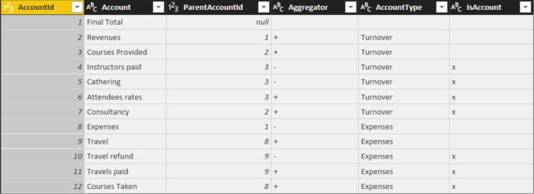
The Account-table also contains of (sub-) totals and the column “AccountType” shows if the positions are regarded as Turnover (Revenue) or Expenses:
Table “Accounts”
1_SwitchAll
My values on “1_SwitchAll” corresponds to “FinalValue” in the article above. The revenues come from consultancy and coursed provided. But the revenue for courses don’t just consist of attendee rates, but the costs for catering and paid instructors shall be deducted (highlighted in yellow). So the “good” numbers that contribute to cash in your pocket shall be reported without a sign and the “bad” numbers that result in an outflow of cash shall be reported with a minus. Within the expenses category, the costs carry a minus and the travel refunds (highlighted in orange), which are cash positive, are reported as positives.
2_SwitchExpensesLiabilities
Another requirement that is often used for balance-sheet-reporting or reports that only report on cost-situations, require that the costs or liabilities are reported without signs. … Principally, because the reimbursements/cost deductions shall be reported with an opposite sign (to show the adverse effect to the cashflow). This is what “2_SwitchExpLiab” shows (not covered in the article).
3_BWT (“BossWantsThat”)
Last but not least comes a typical “BossWantsThat”-requirement: Basically some strange stuff that you just have to deliver. Here the main categories “Revenues” and “Expenses” shall be shown with the signs that reflect the cash-direction, but all specifications that follow below shall be reported without signs (again: Principally, because positions with opposite cash-effects than the main category shall carry inverted signs).
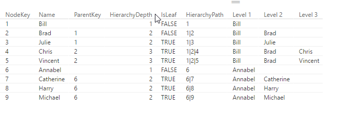
If you use DAX to flatten Parent-Child hierarchies you will end up with a table that has a static number of columns (like described here). If you need a dynamic solution instead, which creates just as many level-columns as there are needed for the current data, you can use DAX’s helper-tool Power Query (or Get Data in Excel) or the query-editor in PowerBI, which uses the language M.
Another advantage of this solution is that you can script the table creation in one step (only flaw: You still need to manually adjust your hierarchy though): But it saves time in creating the table, especially if you have many levels.
Update 2017-Dec-2: It also handles multiple parents now.
2 simple steps to flatten Parent-Child Hierarchies
copy the following function,
add a new step to your current table where you call this function, filling in the following parameters:
table name (which is the name of the previous step in your M-query)
name of the column with the child-key
name of the column with the parent-key
name of the column who’s values shall be shown in the levels (can also be child-key)
Call fnFlattenPCHierarchyFunction
Endless loops
If the relationships in your data are ambiguous, i.e. items stand in parent-child as well as child-parent-relationship to each other, and endless loop would occur. The newest version (V2 upwards) caters for this possibility and will generate a warning and return only the rows that are subject to the endless loop to examine.
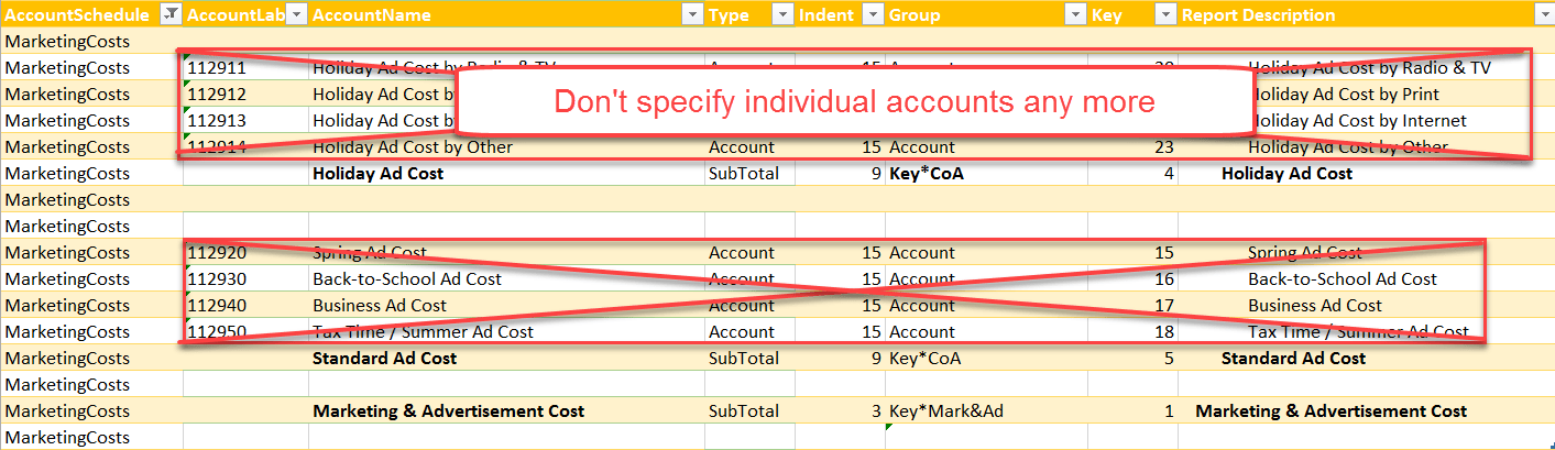
Here comes some long awaited comfort functions for part 2 of my easy P&L series. In the first section I’ve presented the general principle on how to work with a structure using an accounts-group-table. Today I will present 2 alternatives to define the reports without specifying single accounts. So if a new accounts are added to the chart of accounts, you don’t have to adjust your report definitions: Just make sure that to fill in all the fields in your account-group-table and you’re ready to go 🙂
No need to specify single accounts
So you only need to adjust your report definitions if you add new group items. If that’s still too much, take the 2nd solution, which will even eliminate that requirement:
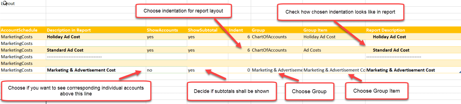
Individual Account Layout: Just define each subtotal and determine for which subtotals single accounts shall be shown
No more specification of individual accounts
How to use it:
How to use Individual Report Layout
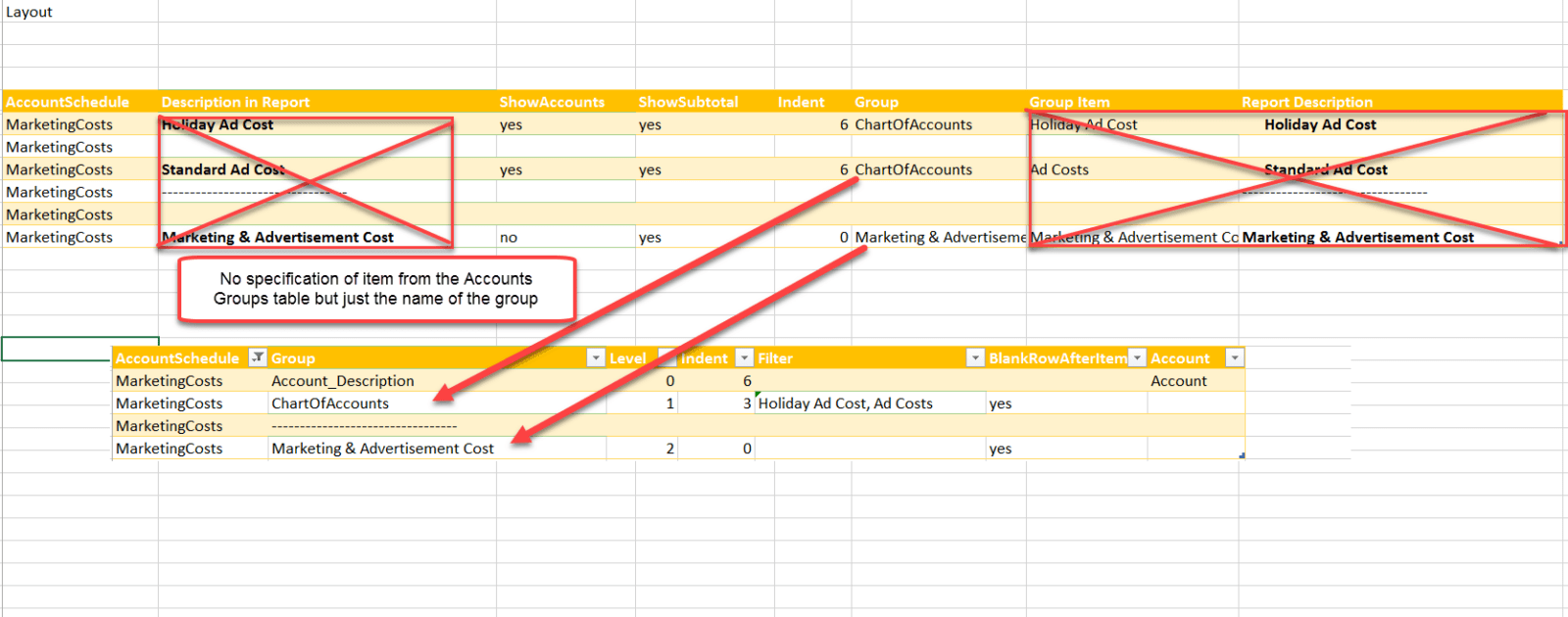
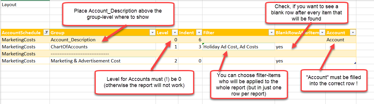
2. Ultrashort Account Layout: Further simplification of just defining the groups (hierarchy) that shall be shown (with option to filter on one of them)
No need to define individual group items
How to use it:
How to use Ultrashort Layout
So these 2 different layouts will both produce the same reports incl. all accounts – just like in the first example. So you can choose which layout-style suits you best – actually, you can use all 3 in parallel. You just have to make sure to grab your pivot-rows from the correct tables and in Excel to grab the matching measures, as they all have their own bridge-tables (which need to be used in the measures):
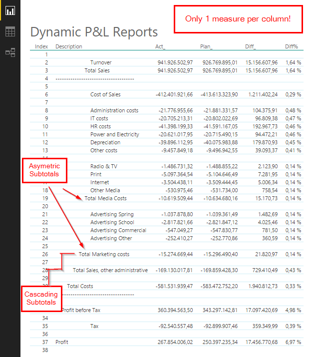
Welcome to part 2 of my series of easy Profit & Loss and other account statements in Power BI and Excel. In the first part I introduced the general principle of creating asymmetric shaped reports who use just one measure per column (you should have read this article in order to understand this post here).
How the technique works
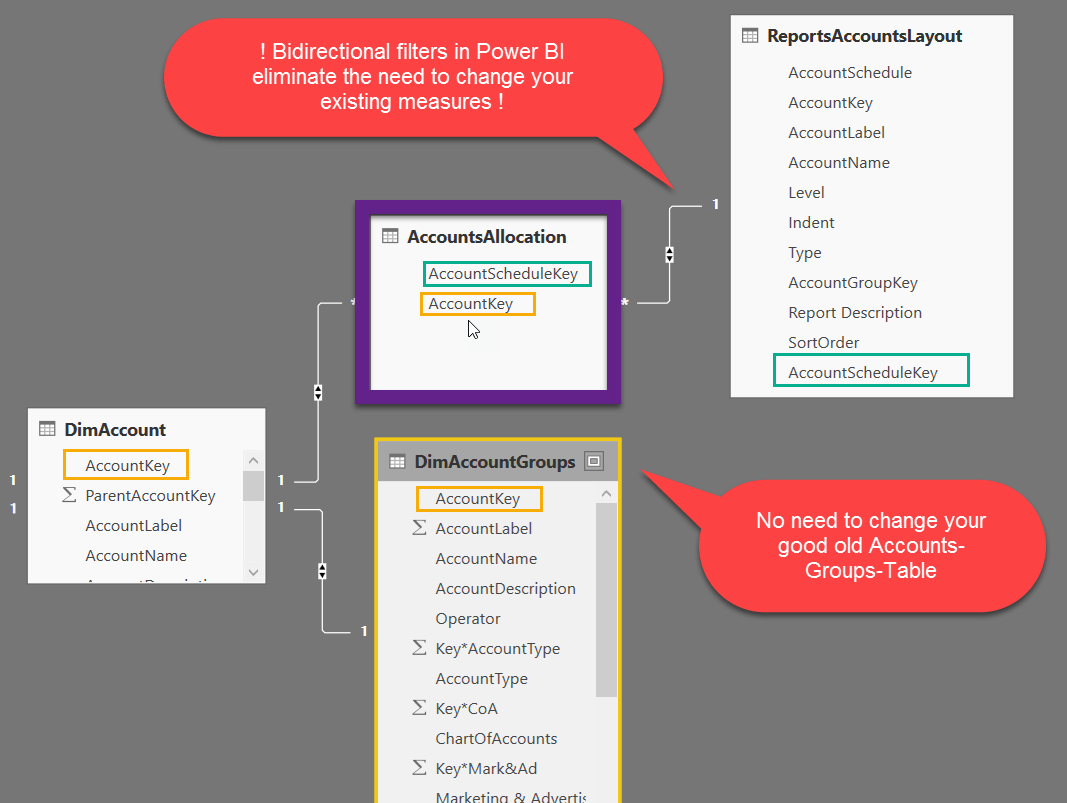
This technique capitalises the aggregation power of the Vertipaq engine and creates a bridge-table between your DimAccount-table and the ReportsAccountsLayout-table. In there for every line of your report, all accounts that belong to the (sub-)totals are matched (“AccountsAllocation”). This table can get very long, but the engine can handle this easily:
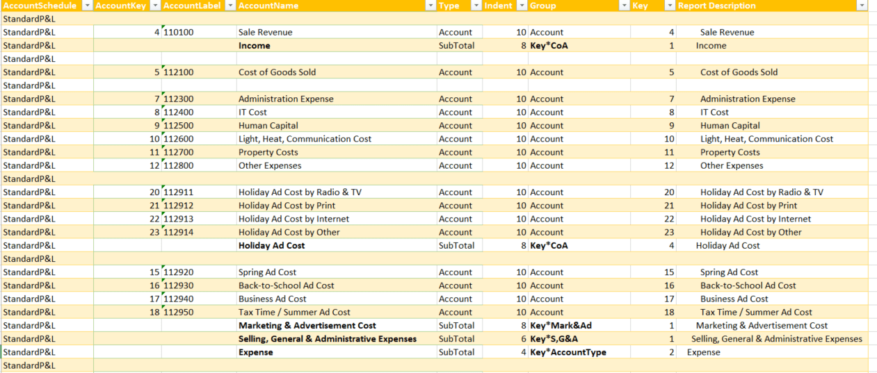
Different use case: Account-groups-tables
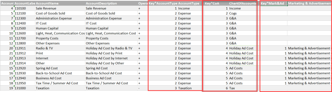
In the first example we’ve worked with a chart of accounts, which had a parent-chield-hierarchy defining all the subtotals of the report. In this example we’re working with a different setup, using the good old DimAccountsGroups-table. Just one row per account and the columns are coming in pairs, containing the group-criteria and the sort-order for the report:
Individual Report-Layout
We also need a second table (ReportsAccountsLayout) that holds the definitions of the report-layouts like this: