Easy Profit & Loss (and other account) statements in PowerBI and Excel – Part2

Welcome to part 2 of my series of easy Profit & Loss and other account statements in Power BI and Excel. In the first part I introduced the general principle of creating asymmetric shaped reports who use just one measure per column (you should have read this article in order to understand this post here).
How the technique works

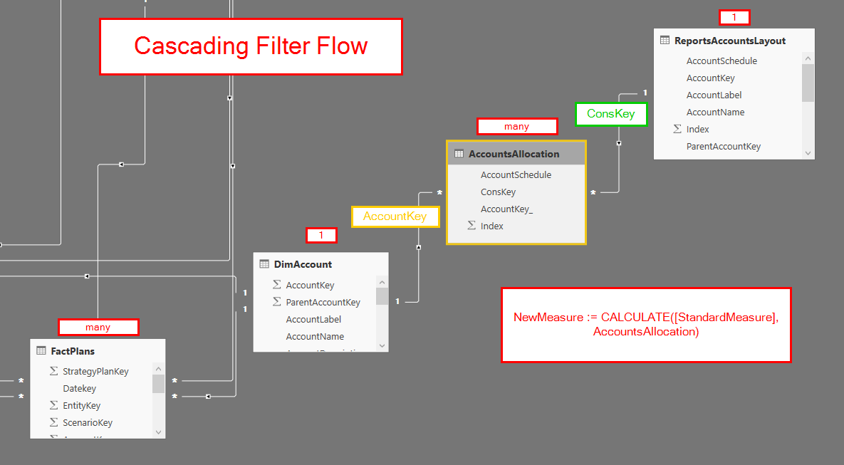
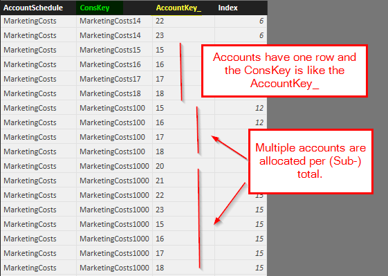
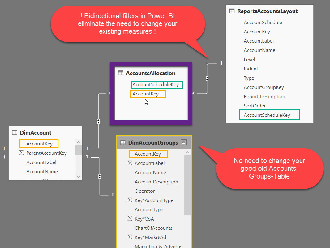
This technique capitalises the aggregation power of the Vertipaq engine and creates a bridge-table between your DimAccount-table and the ReportsAccountsLayout-table. In there for every line of your report, all accounts that belong to the (sub-)totals are matched (“AccountsAllocation”). This table can get very long, but the engine can handle this easily:
Different use case: Account-groups-tables

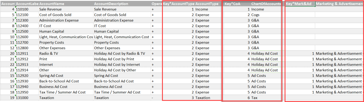
In the first example we’ve worked with a chart of accounts, which had a parent-chield-hierarchy defining all the subtotals of the report. In this example we’re working with a different setup, using the good old DimAccountsGroups-table. Just one row per account and the columns are coming in pairs, containing the group-criteria and the sort-order for the report:
Individual Report-Layout

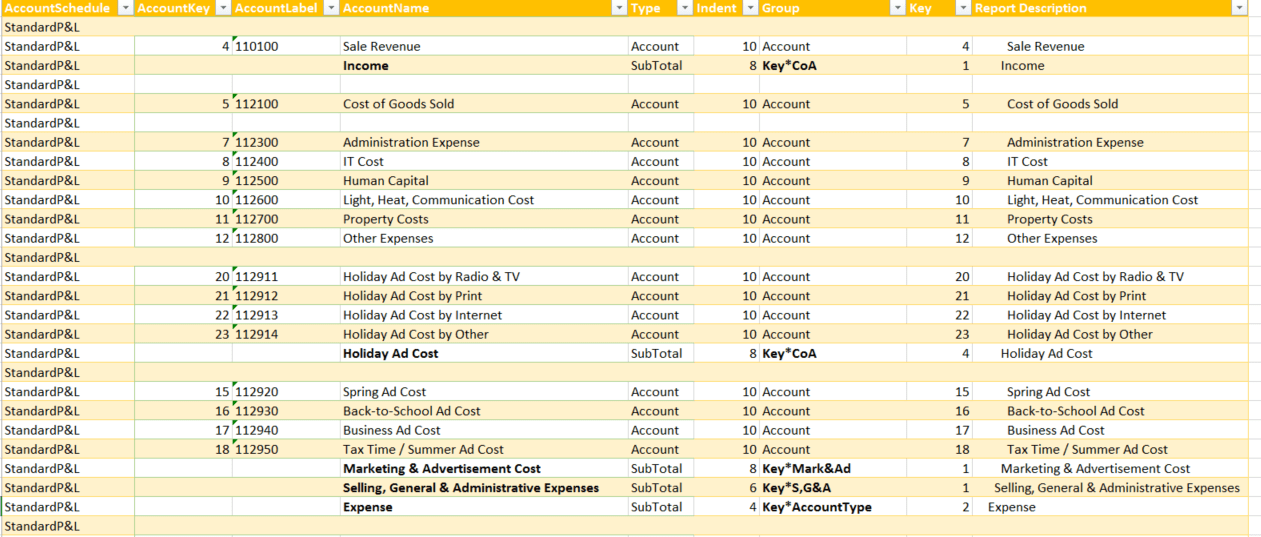
We also need a second table (ReportsAccountsLayout) that holds the definitions of the report-layouts like this:
Read more

Easy Profit and Loss and other (account) scheme reports in Power BI and Power Pivot using DAX

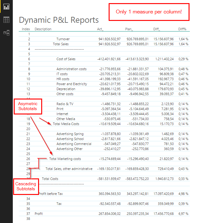
This is about an easy way to create typical finance reports like Profit and Loss using DAX that (unlike all other solutions I’ve come across so far) can be handled with very basic knowledge of this language like this:

Image1

The trick

The trick that makes my solution so easy lies in the fact that it requires no aggregation functions of the output-mediums like:

  • pivot-tables: who struggle with asymetric logic and are not available in Power BI so far
  • cubefunctions: who are not available in PowerBI so far

So we have to build the details as well as all aggregations into the solution as it is and don’t rely on/use any aggregation functions (This means for Excel: We have to turn off subtotals as well as totals in our pivot tables. It means for Power BI: Hurray! Finally a solution where the lack of pivot-tables doesn’t matter).

How to

The aim is to create a table/matrix with (account) details and aggregations into the rows and different slices of time-Intervalls or comparisons into the column sections. As for the columns, this will be covered by measures like [Actuals], [Budget], [PreviousPeriods], [Differences in all shapes…]. And – as the values in the columns should be the same – I’d prefer to use only one measure per column – that is fully sliceable and works on all (sub-) totals of course. … Ok – so some dreams later I found it:

MyMagicMeasure := CALCULATE([StandardMeasure], AccountsAllocation)

So you just wrap simple measures like Act=SUM(Fact[Amount]), Plan=SUM(Plan[Amount]), DiffPlan_Act=[Plan]-[Act] … into the CALCULATE together with the bridge-table as the filter-argument:

This is the many2many-technique in it’s simplest form (PostFromMarcoRusso). It all goes via simple aggregation on all accounts found in the filter context:

Image4

Our  bridge-table “AccountsAllocation” consists of one account number per simple account and has multiple rows for the (sub-)totals – being all accounts that belong to them:

Image5

The ConsKey stands for the row in our report (1) and the AccountKey_ holds the account numbers that are going to be aggregated (many (for the sub-totals) and 1 for the account-rows). So all we need is this unique and simple aggregation on AccountKey for every row in the report – with a filter from the Reports-table via our bridge table to the DimAccounts, who then filters our FactTables: 1 -> many -> 1 -> many.

Read more