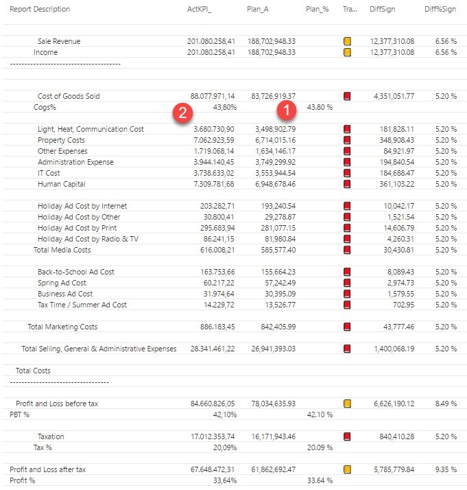
Right aligning text (please vote for it here: Right align text in Power BI – edit 15th Nov: We’re there: Right aligning text is available now: https://powerbi.microsoft.com/en-us/blog/power-bi-desktop-november-2017-feature-summary/)
Display numbers in different formats within one column (either to be implemented as a “neutral” format for Switch-measures, where the referenced measures carry the formatting attributes already, or as a part of a formula-based conditional formatting) (Thanks Matt for the voting-link: Conditional format SWITCH measure)
So for the moment I choose between the following workaround-options:
Display %-values in a separate column
Format numbers as text and fill up with spaces so that all end up right aligned
See the suggestion from Matt Allington in the comments below (very nice)
Right aligning text or percentage figure in new column
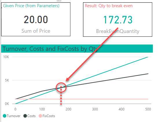
A break-even analysis tells you at which value of the parameter in question your profit-calculation will turn positive (link). Here we need to sell at least 173 at a given price of 20 before we’ve recovered all our costs:
If your variable costs are constant, you can solve it by this formula:
BreakEvenQuantity = Total Fixed Costs / (Unit Sale Price - Unit Variable Costs)
You’ll find tons of examples on how to do this in Excel like here.
Non-linear cost structure
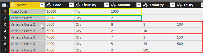
But in real life, the variable costs often depend on certain quantities as you get discounts for purchasing large amounts. The following table shows a cost structure with fix costs in row 1. The 3rd column “FixOrQty” indicates if the cost item is fix or dependent on the quantity (Qty). The 2nd row contains a variable cost that is constant with 2 for all quantities. Row 3&4 show a variable cost of 8 for quantities up to 100 and if you purchase more than 100 the costs will be lowered to 2 for all additional quantities. Row 5-7 have a similar structure, but with 3 quantity ranges:
In finance & accounting, you very rarely report the figures with the signs of their source systems, but switch (certain) signs according to different needs. Instead of using unary operators for it, I’ll present an easy and dynamic way for it in Power BI and Power Pivot using DAX. It will cover the following 3 main scenarios:
1_SwitchAll: All signs are switched (red)
2_SwitchExpLiab: Expenses and liabilities are switched back to their original values (green)
3_BWT_Indiv: Only the main figure for expenses (or liabilities) carries a minus, all following positions specifying the expenses are (principally) reported as positives (blue)
Switching signs in Power BI and Power Pivot without unary operators
I’m using the sample data from this article but changed the source-data to a double-bookkeeping structure. There signs are used and the transaction entries in your ledger table always add up to zero. This is a method that prevents errors when posting and can also be used to prevent errors in reporting. If you keep the signs in your reporting system, all you have to do is add up the relevant figures and the returned (absolute) figures will always be correct. If you have read my previous articles on Easy P&L, you have seen this method in action: No minus-operation there, just a simple stupid adding of all accounts who fall into several (sub-) total categories via the bridge-table.
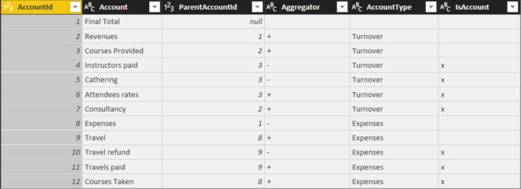
The Account-table also contains of (sub-) totals and the column “AccountType” shows if the positions are regarded as Turnover (Revenue) or Expenses:
Table “Accounts”
1_SwitchAll
My values on “1_SwitchAll” corresponds to “FinalValue” in the article above. The revenues come from consultancy and coursed provided. But the revenue for courses don’t just consist of attendee rates, but the costs for catering and paid instructors shall be deducted (highlighted in yellow). So the “good” numbers that contribute to cash in your pocket shall be reported without a sign and the “bad” numbers that result in an outflow of cash shall be reported with a minus. Within the expenses category, the costs carry a minus and the travel refunds (highlighted in orange), which are cash positive, are reported as positives.
2_SwitchExpensesLiabilities
Another requirement that is often used for balance-sheet-reporting or reports that only report on cost-situations, require that the costs or liabilities are reported without signs. … Principally, because the reimbursements/cost deductions shall be reported with an opposite sign (to show the adverse effect to the cashflow). This is what “2_SwitchExpLiab” shows (not covered in the article).
3_BWT (“BossWantsThat”)
Last but not least comes a typical “BossWantsThat”-requirement: Basically some strange stuff that you just have to deliver. Here the main categories “Revenues” and “Expenses” shall be shown with the signs that reflect the cash-direction, but all specifications that follow below shall be reported without signs (again: Principally, because positions with opposite cash-effects than the main category shall carry inverted signs).
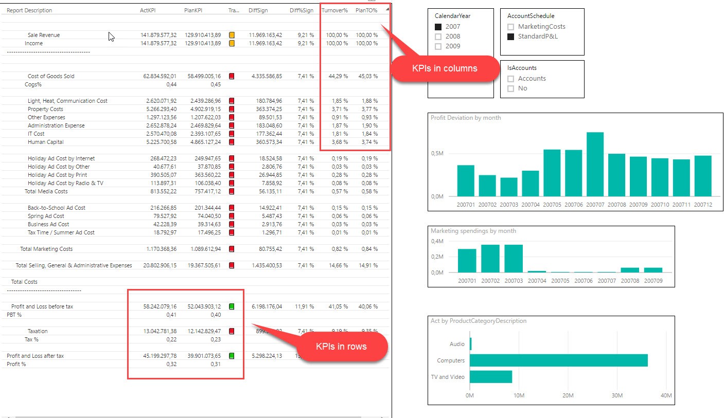
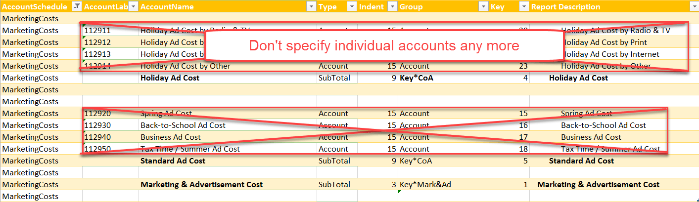
Here comes some long awaited comfort functions for part 2 of my easy P&L series. In the first section I’ve presented the general principle on how to work with a structure using an accounts-group-table. Today I will present 2 alternatives to define the reports without specifying single accounts. So if a new accounts are added to the chart of accounts, you don’t have to adjust your report definitions: Just make sure that to fill in all the fields in your account-group-table and you’re ready to go 🙂
No need to specify single accounts
So you only need to adjust your report definitions if you add new group items. If that’s still too much, take the 2nd solution, which will even eliminate that requirement:
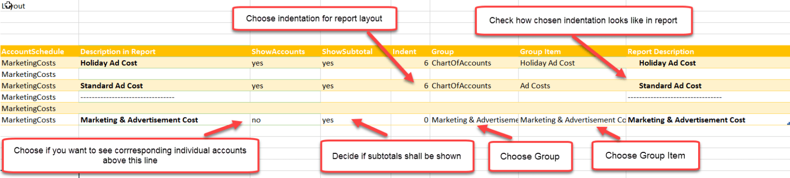
Individual Account Layout: Just define each subtotal and determine for which subtotals single accounts shall be shown
No more specification of individual accounts
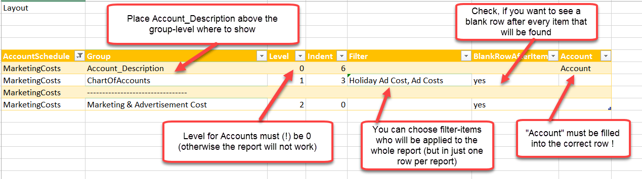
How to use it:
How to use Individual Report Layout
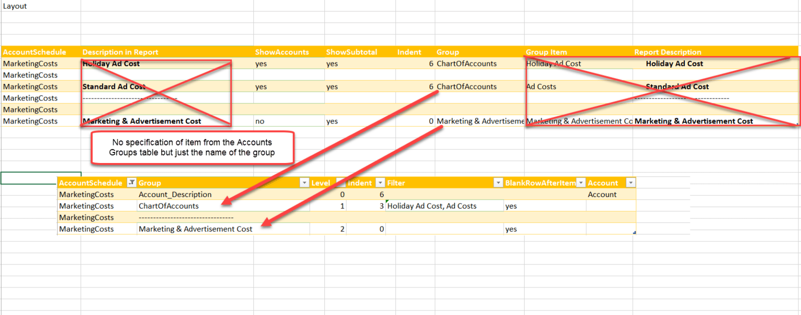
2. Ultrashort Account Layout: Further simplification of just defining the groups (hierarchy) that shall be shown (with option to filter on one of them)
No need to define individual group items
How to use it:
How to use Ultrashort Layout
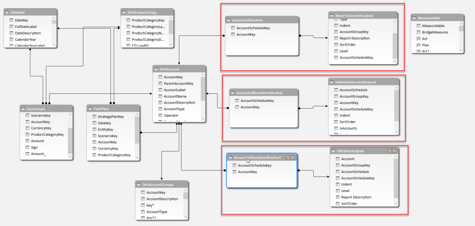
So these 2 different layouts will both produce the same reports incl. all accounts – just like in the first example. So you can choose which layout-style suits you best – actually, you can use all 3 in parallel. You just have to make sure to grab your pivot-rows from the correct tables and in Excel to grab the matching measures, as they all have their own bridge-tables (which need to be used in the measures):