
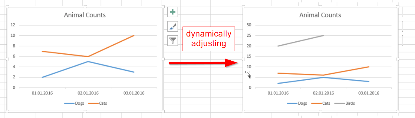
There are many good reasons not to use Pivot charts as described in this article i.e. – one I would like to add is the bug when using “invert if negative”: The inverted colour will disappear once you refresh your data.
If you use Power Query to create the pivot for your chart, a regular chart will be created on it: Gone are the restrictions that come with the Pivot-Chart and it will also adjust dynamically to new or deleted rows and/or columns.
How to create your regular charts on dynamic pivot tables:
1. Simply pass your table that contains the data to Power Query:

2. Check your series column and pivot on it with Y as the Values-column:

This will create a table output that you can format like a pivot-chart. But as will remain of type standard-Excel-Table, the charts generated on it will be regular charts: Nice formatting and dynamically adjusting.

BTW: Have used this technique in my waterfall-chart.
Enjoy & stay queryious 🙂
It’s a great idea. Thanks you for sharing.
Gaming has become more than entertainment for me; it’s a way to relax, explore new worlds, and connect with friends while enjoying challenges and improving skills daily. https://lottery7.rajssp.org/
I love how modern games combine storytelling and gameplay so well, making every session feel like an immersive adventure filled with action, emotions, and unexpected twists. https://okwin.lucknowgamez.club/
Multiplayer games are amazing because they let you compete and cooperate with players worldwide, building teamwork, strategy, and communication skills while having fun. https://jalwagame.epfounifiedportal.com/